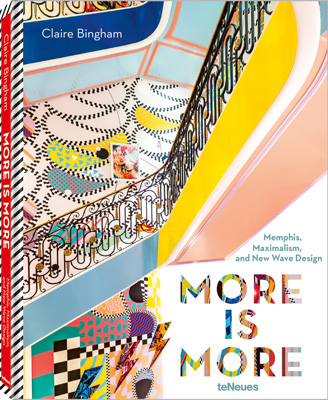
More is More. Πέντε τρανές αποδείξεις ότι ο μαξιμαλισμός είναι πάλι στη μόδα.
Σύμφωνα με την Bingham: “The book is a celebration of design that feels happy. This is design that goes beyond the comfort zone. It makes you smile.”
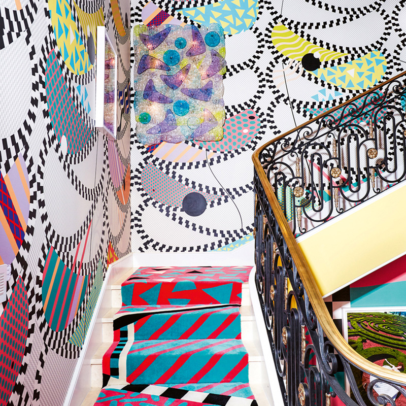
Sasha Bikoff
“If there was any designer to sum up the adage: ‘more is more’, Sasha Bikoff is it. She recently completed a project for the Kips Bay Decorator Show House on the Upper East Side of Manhattan that is megawatt happy. It scatters colour and pattern like confetti and to me, is everything that maximalism is about.
“Yes, it is the antithesis of minimalism – there’s an awful lot of design going on here but more than that, it’s Bikoff’s ability to combine so many opposing, complicated elements.
“For all its design credentials, the scheme projects strength and confidence. Faced with the challenge of designing a staircase in the townhouse rather than a reception room, Sasha owned it and decided to do crazy beautiful regardless of the tricky space.”
Jaime Hayon
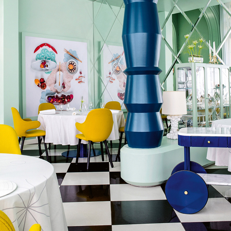
“In the years since he founded his eponymous design studio, Spanish designer Jaime Hayon has created work for the likes of Cassina, Fritz Hansen, Bisazza and Baccarat – as well as interiors for leading hotels, restaurants and retail spaces.
“No stranger to Memphis or maximalism, his distinguishable whimsical and colourful style, stacked totem shapes and dazzling patterns makes him a modern day Alessandro Mendini.
“He is daring – and this has always influenced his attitude and creativity. At his interior for La Terraza del Casino in Madrid, guests are greeted by Hayon’s characterful tropes. In this space, eyes, noses, ears and mouths are drawn into the lamps, trolleys and tableware. Known for his recurring use of figurative shapes, the building is literally smiling back.”
Schneid Studio
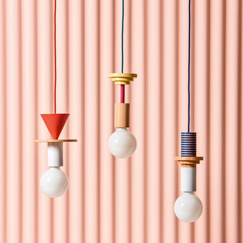
“With German studio Schneid, what’s really nice is the detail. With their candy-drop Junit pendants they incite even the most cautious to get creative with lighting.
“Evolving the taste for industrial-style bare bulbs with their interchangeable, stacked, geometric shapes, they have married simplicity with character, instilling personality into an object that fits with the playful spirit of Memphis design. For a closet maximalist, this is a lovely way to add interest to a room – on a daintier scale.”
George Sowden
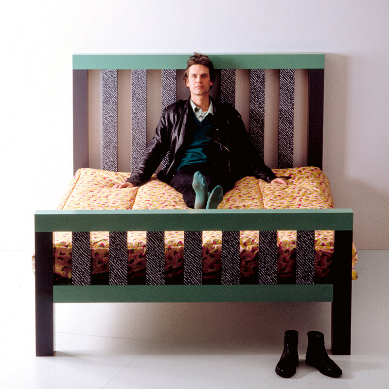
“Originally from Leeds, George Sowden has been a Milanese native for almost five decades. Recognised for his Memphis colour-blocked and geometric designs such as the Saragoza chair and long-legged D’Antibes cabinet designed in 1981, he switched this aesthetic to all manner of objects from his zigzag-shaped lighting, clocks, and textiles.
“Think of 1980s motifs and his abstract patterns in bold, clashing colours is where it all began. His life as a product designer was nurtured by Memphis and continues today with products such as the colourful, covetable Coffee and Softbrew Teapot for Danish design company HAY and the Bertie Bassett-like Zeta table for British company Another Brand.
“With so much personality embedded in his designs, why have a plain side table, when you can choose this?”
Bethan Laura Wood
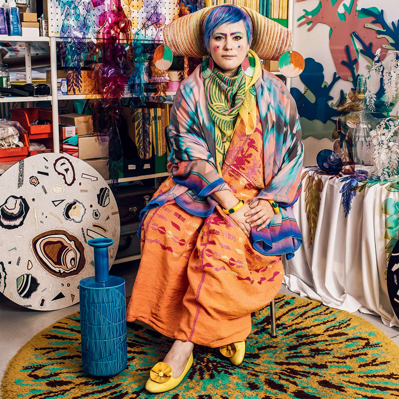
“British designer Bethan Laura Wood is one of my maximalist faves. From her bags with a toothpaste-y handle produced for Italian leather goods brand Valextra to her collaboration with fashion designer Peter Pilotto at his townhouse last year, she has a unique way of seeing things and is extremely present in everything she does.
“What sets Wood apart is her curiosity and desire to experiment with materials, resulting in objects that are a feast for the senses. Laminate is a main connector between her work and Memphis. She shares the Memphis Group’s affinity for working with materials that are known within one industry and then using them in another.
“Colour, pattern and new technologies – all of this is something she likes to grapple with every day in modern design. Boring she is not.”
More Is More: Memphis, Maximalism, and New Wave Design
της Claire Bingham
teΝeues
Πηγή: dezeen.com
